As I pinned up what I had spent the last 13 weeks creating, a wave of embarrassment flooded over me. I knew what I had done was not enough. I knew I could have done so much, what was on that A2 sheet did not represent my vision and I knew then and there, that was something I never wanted to experience again.
This particular semester of uni was the first real project we had worked on and by far the largest site, both physically and in terms of how many stakeholders there were. My first mistake was not recognising this dramatic difference between this and other pieces of assessment we had completed. Previous university projects had allowed me ample opportunity to use my time about as ineffectively as possible and still hand in something that vaguely resembled a completed project.
I started out much the same as I had any other assessment; ticking boxes for the class work, showing up each week and actively participating in class. It all seemed very reasonable at the time, but this is actually where the wheels began to fall off.
Here’s some lessons I learnt.
SMART WORKING
The work you do in class is simply a framework for the design. It informs the project you’re creating and gives you the opportunity to receive feedback on work you’ve done and most importantly, where you’re headed. It is not the work.
The work is separate to class time, it’s squeezed into the inbetween times, on the commute, whilst shopping, exercising, when hanging with friends, whilst doing your day job.
I was treating my design projects with a mental on/off switch, allowing me to do work some of the time. I should have been doing some work all of the time – the on/off switch should be stuck in the middle; a steady stream of shitty power supply that occasionally produces bright ideas. Then all you need to do is record these ideas (either in a physical book, digital notes or as bookmarks) and when you sit down to work, you’re essentially just connecting the dots.
Weirdly, the outcome is a direct response to the time you have put in. Who would have thought?
WORTHLESS IDEAS
“But my design is so good!” is what I said to myself as I stared at my half filled presentation board, watching people file past no doubt thinking not that at all…
The tragedy was I had completed many key components: a plan, sketches, renders and I had a very clear picture of what I wanted the project to be, how it worked and how it fit the brief. All of this became utterly, utterly worthless the moment it didn’t make it onto the presentation board. This seems incredibly obvious but people can’t see what you don’t show. Some is better than none is absolutely true in this case. You can talk about some, people can see some, you can get feedback on some. I brutally learnt the same cannot be said for none. This is especially true if you’re presenting to other designers, they can read between the lines, they can ask questions about what you were attempting to show, they’ll be able to see your thoughts on the page.
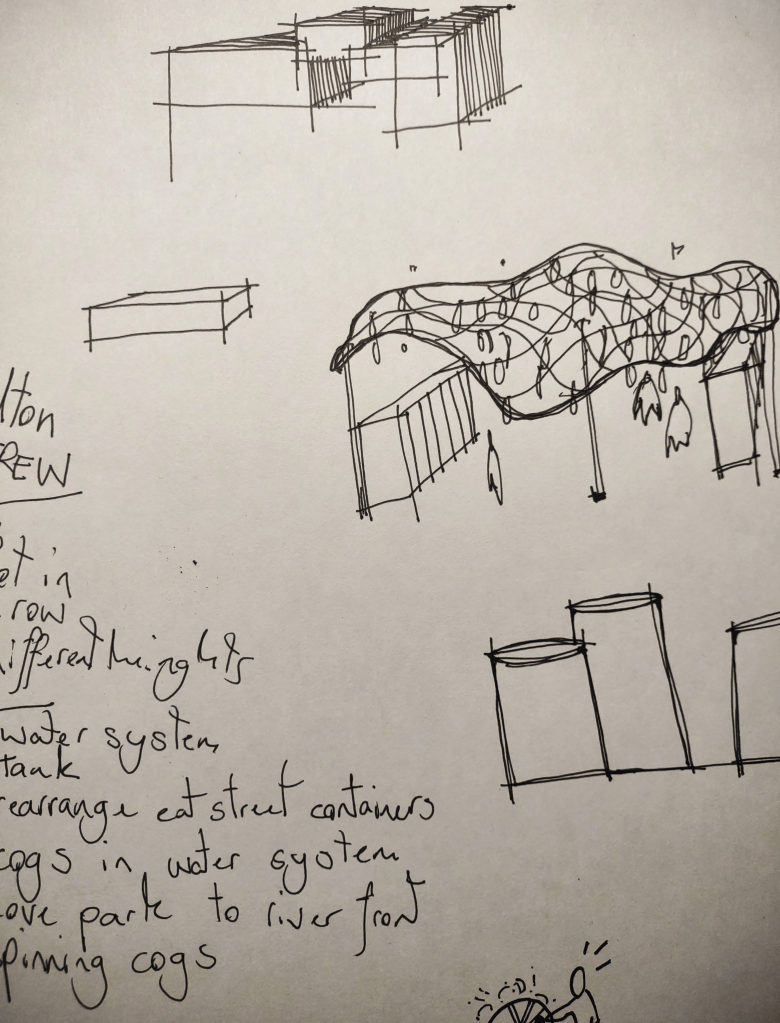
This is part of why I now value sketching so much. Having presented absolutely nothing, presenting a shitty sketch done on a bus, scanned in and blown up to a pixel-blurring size is a breeze in comparison. Do those ten minutes renders; they might look bad now, but you’ll be pleased you have at least something to talk about.
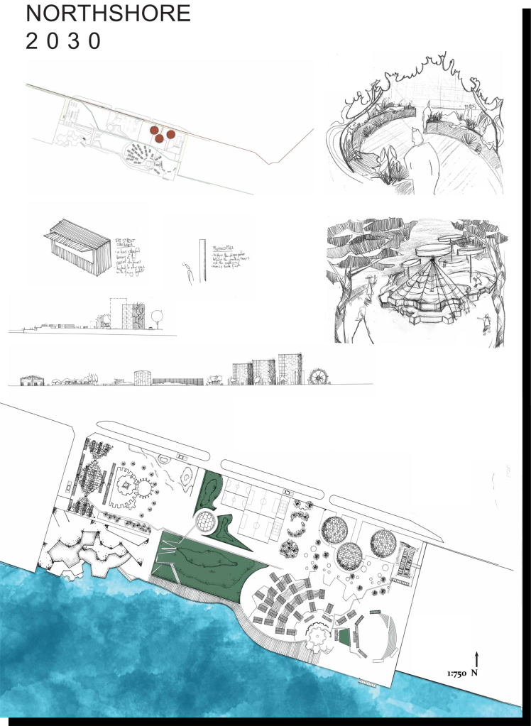
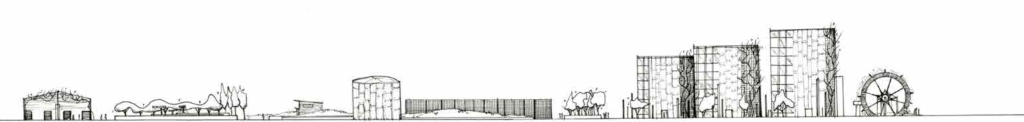
In my most recent project, I looked at the Fresh Kills Park document produced by Field Operations as a reference. As with most of their renders, they are effortlessly simple (pg23 for example), yet convey everything you want to know and with many of these scattered throughout a document, you’re able to build up an idea of what the designer wants the project to look like.

Do sketches and smash out those shitty renders early. You’ll thank yourself later.
BE BETTER THAN YOURSELF NOT YOUR PEERS
We all know that comparison is the thief of joy and this project led me to believe that this is doubly true within landscape architecture and design. My constant checking of how far along my peers were, what they were doing, how they were approaching certain design issues led me into a deep spiral of analysis paralysis: I essentially got nothing done.
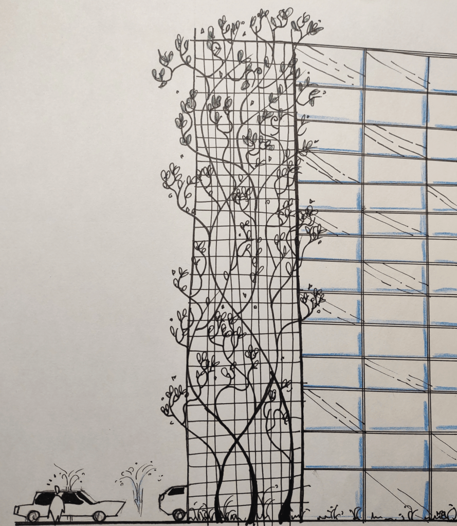
Again, this project only reinforced the importance of hand sketching. Bad drawings would have done me much better than looking at brilliant work done by my peers. Once you’ve started with a bad drawing, you’re incentivised to improve it, improve the design, do more bad drawings and further improve the design; it’s an upwards staircase to getting the best design outcome from yourself.
While you can and should be inspired by other people’s work, looking at it is not the foundation to doing work yourself.
This project changed how I did uni, how I viewed landscape and the standards I held myself accountable moving forward; it was an awful project, full of brilliant ideas that never came to fruition.

Leave a comment